Learning how to interpret crypto charts is the first thing that users must learn when entering the crypto world. By looking at price charts, users can determine what is happening at the moment, what has already passed, and how the market performs along the way. If you are eyeing price tracking and want to gain better insights, then learning how to interpret charts is important. To conveniently monitor prices, most users prefer to download a non-custodial Web3 wallet such as the Noone Wallet. It will enable you to secure your crypto holdings and monitor the market actions in real-time.
This tutorial will show you how to read cryptocurrency charts in plain English. Without complex math. Without cryptic terminology. With only the fundamentals to get you started.

How to Read Crypto Charts (Beginner's Breakdown)
A crypto chart is the graphic representation of the price action over time. It indicates the starting point and the current position of the price. All charts provide the viewer with the following information. When the trades took place. At what rate. And to what extent.
Charts eliminate guesswork. Rather than responding to headlines, you analyze data. A pattern emerges. A trend is revealed. This is why knowledge about reading crypto chart data is so critical.
What are the usual types of cryptocurrency charts?
In crypto, several types of charts exist. Each type shows price data in a distinct fashion. Typically, line charts and candlestick charts are the first encountered by a beginner.
There are other types of charts, but most media provide these two types in balance. The amount of data represented in your graph will determine what type to use.
What's the bottom line here?
Each graph has different uses.

Line chart
A line chart connects closing prices with a simple line. Each point represents the price at a specific time. When connected, they form a smooth curve that shows general direction.
Line charts are easy to read. They remove noise and focus on overall movement. This makes them helpful for long term observation.
However, they hide detail. You cannot see price swings inside each period. You only see where the price ended.
Sounds simple? It is.
Line charts show direction, not behavior.
What is a candlestick chart?
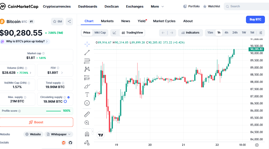
A candlestick chart will display additional information. A candlestick will represent a certain period of time. It will display the opening, closing, highest, and lowest prices.
The body of the candle represents open and close differences. The wick represents extremes. Green candle represents a rise in price. The red candle represents a fall in price.
A candlestick chart is the most popular crypto chart. It assists traders in understanding momentum and emotions.
Which one should I choose?
For new traders, the usefulness of both charts cannot be overestimated. Line graphs allow you to see the big picture. Candlestick charts allow you to see what's happening inside that big picture.
For instance, if you want to know more about crypto price chart readings, begin with learning about candlesticks, as they offer more information when you are familiar with their composition.
Theory aside. How does it feel on the trail?
Candlesticks reveal the story behind price action.
How to read a Candlestick Chart?
Each candle can be seen to represent a small story. It begins with an opening price. It concludes with a closing price. The top end of the candle represents the highest point reached. The bottom end represents the lowest point reached.
Long bodied candles indicate strong movement. Short bodied candles indicate indecision. Long wicks indicate price rejection.
Candlestick chart readings consider context. Individual candles are meaningless. Groups of candles create patterns.
Why traders use candlestick charts
Trader traders like the candlestick chart because psychology is visible. The influence of fear, confidence, uncertainty, and momentum is seen in the shapes.
Candlestick charts can also be used on any time frame. These charts can be used for long-term trading or for day trading charts for cryptocurrency.
They are compressing information without losing meaning. This balance has made them highly popular.
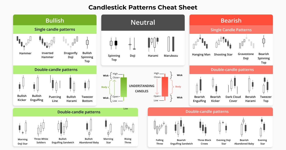
What do bullish and bearish candlestick patterns mean?
Bullish patterns point towards an increase in prices. Bearish patterns indicate a fall in prices. These patterns are formed when a combination of candles occurs in a certain manner.
Bullish examples will involve strong green candles following a fall. Bearish examples will involve strong red candles following a rally.
"Patterns don't predict the future, but they describe the probability of what may happen given past experiences."
The volume axis on the crypto-charts:
Volume shows how much trading happened during a period. It usually appears as bars under the price chart.
High volume means strong participation. Low volume means weak interest. Volume helps confirm price moves.
If price rises with high volume, the move looks stronger. If price rises with low volume, it may be fragile.
Sounds complex? Let’s see it in practice.
Price moves without volume often fail.
What is Support and Resistance?
Support is a price level where buying often appears. Resistance is a price level where selling often appears.
Support acts like a floor. Resistance acts like a ceiling. Prices tend to bounce or pause around these levels.
These zones form because traders remember past prices. Behavior repeats.
Short sentence. Simple idea.
Memory shapes markets.
What are trend lines and price channels?
Trend lines connect higher lows in an uptrend or lower highs in a downtrend. They show direction.
Price channels form when price moves between two parallel trend lines. They help visualize boundaries.
Trend lines are guides, not rules. They help structure observation.
What are technical indicators?
These indicators can be inserted on top of a chart to make it easier to analyze price action. These indicators rely on mathematical expressions related to price and volume.
Indicators will never substitute for charts. Indicators are helpers for charts, not solutions for beginners.
Too many indicators can be confusing.
Less is more.
A moving average is what?
The moving average smoothes out price data. It reveals average price and not actual price.
A short term moving average responds quickly. A long term moving average responds slowly.
When the price remains on one side of the moving average, the trend will appear to be either good or weak.
Easy-to-use tool. Huge realization.
Basics
Some patterns appear often. Triangles show consolidation. Flags show pauses. Double tops and bottoms suggest reversals.
Candlestick patterns like doji candles show indecision. Strong closing candles show conviction.
Patterns help describe behavior. They do not guarantee outcomes.
So what’s the main takeaway?
Charts reflect behavior, not predictions.
Conclusion
It takes time to learn how to read crypto charts for beginners, but it is simple for the basics. These include price, volume, and market action. Candlestick charts offer the best perspective for most traders. Support, resistance, trend, and volume are factors that impact market action.
This tutorial has broken down the process of understanding cryptocurrency charts easily. With time, such patterns become familiar, and one can easily gain confidence.
Users use tools such as Noone Wallet, which is not custodial, so they are able to manage their assets while monitoring the market. This understanding enables one to remain calm, informed, and organized in the midst of this fast-paced market.


